It wasn’t easy and for a moment it appeared that UPS was going to tag them as undeliverable– long story but basically my NYC apartment building has a broken doorbell to my apartment, so I had to stand outside between 10am and 6pm to catch the delivery guy– but that all does not matter now, because they’re finally here!
And I humbly hope I don’t say so myself, but they’re gorgeous!
In the words of Bob Hope, “Rooowrrrr.”
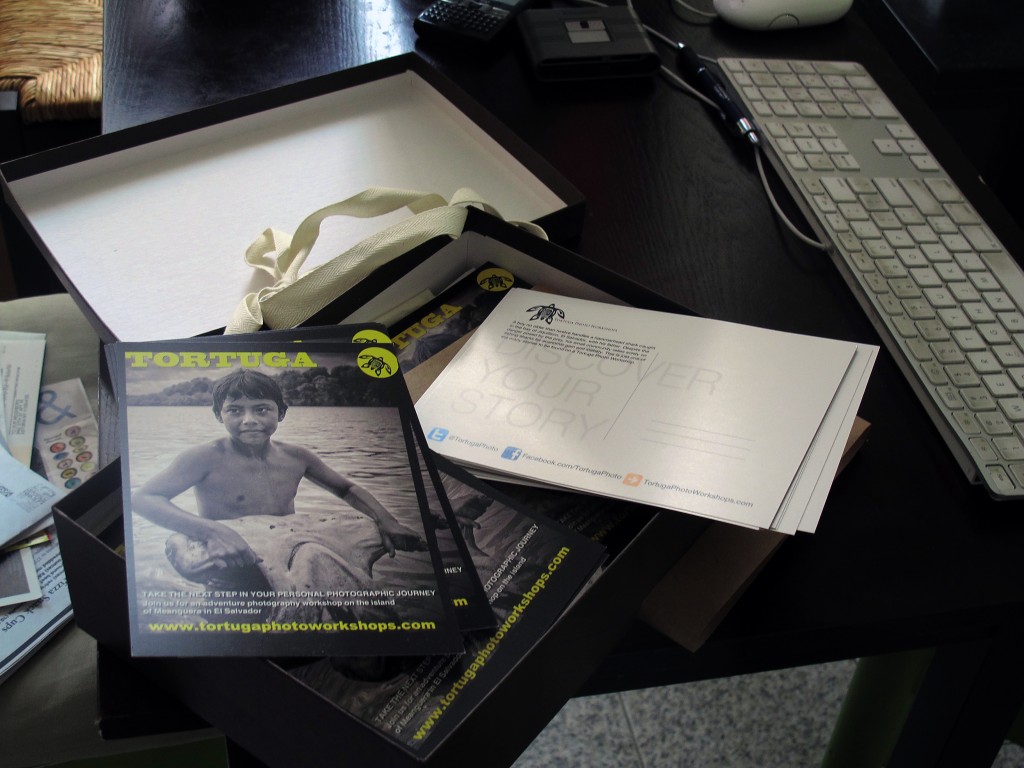
In the coming weeks these babies will be flying all across the world to our educational partners, schools, colleagues, prospective students and my mom.
It’s a mini-milestone (milepebble?) that started late last year when I signed on with Tortuga to teach photojournalism and multimedia. Immediately I dove in by putting together a website and designing these posts cards. We think they’re pretty spiffy and I tried to put a lot of thought into the design, going back and forth for weeks as we redesigned them not once, not twice but four times.
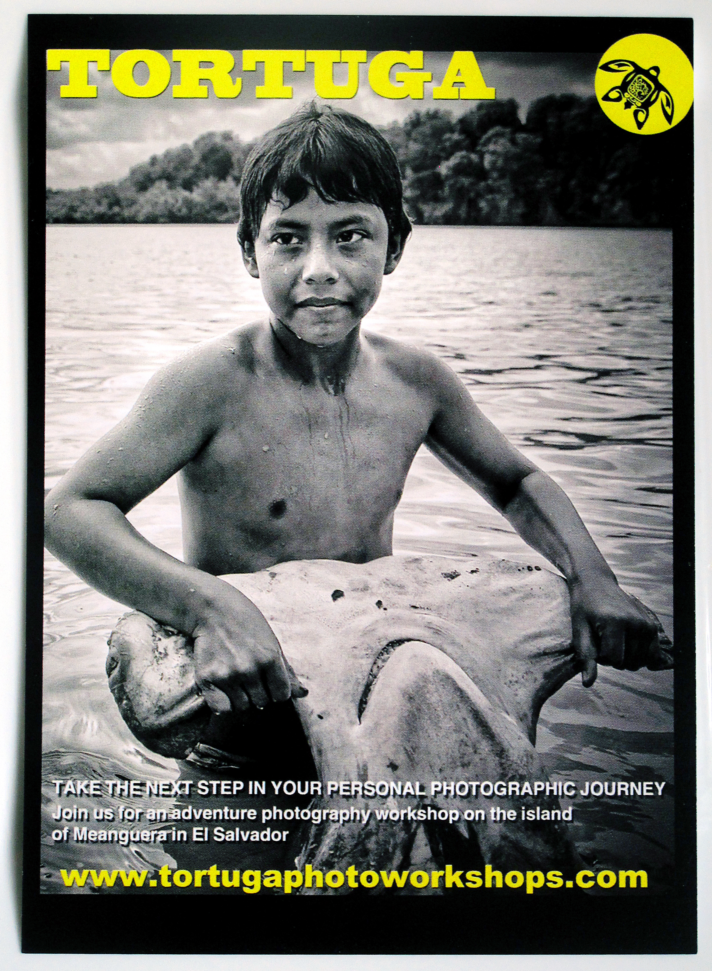
The decision was made early on to go with a postcard: they’re eye catching, invite viewers to post them to a wall or fridge, can be viewed quickly and invoke the feeling of travel, which is perfect for a week-long workshop in another country.
I love minimalist design and I knew I wanted to take advantage of lots of negative space and keep everything very clean and simple. I approached it with one goal, to create a postcard you would want to pin up at work.
For the front I fell in love with an image created by my fellow Tortuga instructor Roberto Rosales, of a boy handling a hammerhead shark during a previous workshop on the Island of Meanguera, El Salvador. The image not only gives a taste of the stories to be found at the workshop, it’s tack sharp, perfectly exposed and has this very rare unusual and arresting juxtaposition of the calm boy against the serrated teeth of a shark in his hands.
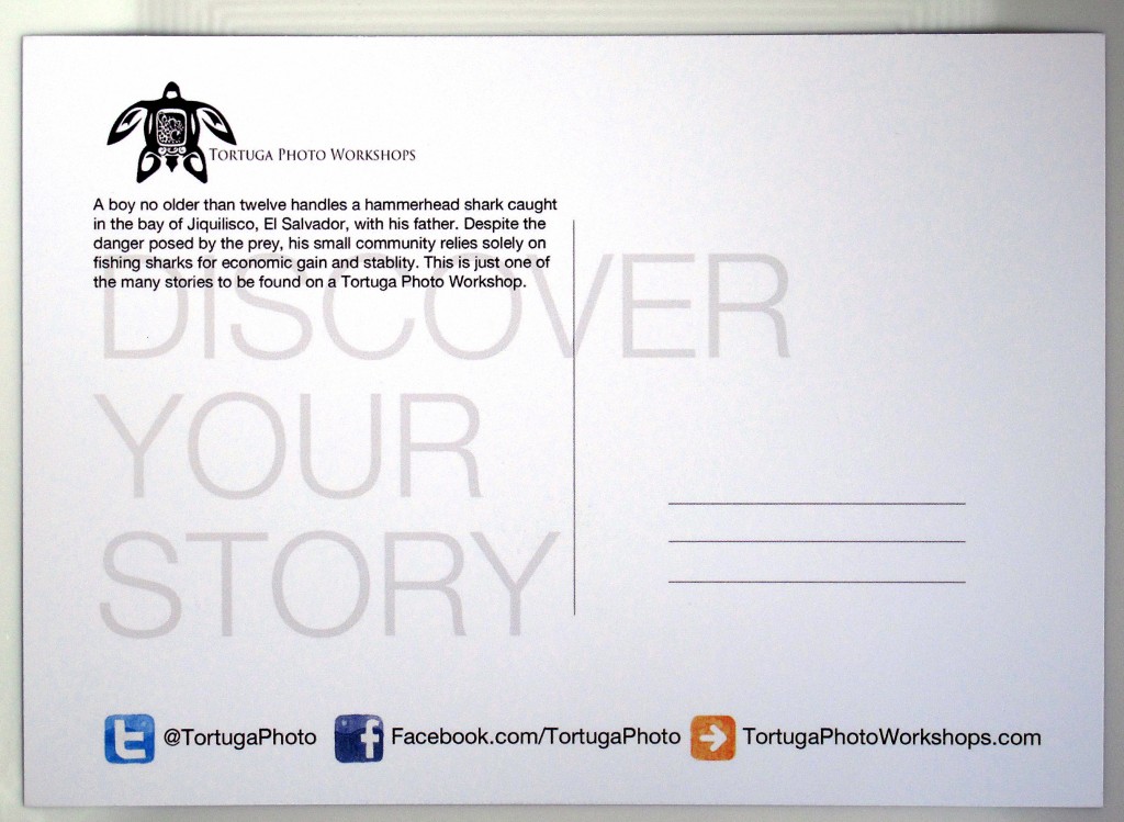
The caption, which I wanted to include because as a photojournalist I think it’s crucial that we add to the story once viewers are hooked in by a beautifully shot image, is on the back side of the card.
But before we could get to the back, we next had to make selections of text, fonts and colors. In the past Tortuga Photo Workshops had kept it monochromatic with black on white, but we wanted to introduce a splash of color and hit on a shade of yellow that was bright with just enough depth as not to look flat. Marrying the Tortuga logo to the yellow was an instant smile inducer.
For the copy we kept it simple and brief. The point of our postcard after all was to draw you in and give you a well designed product you’d enjoy looking at, even pinning to your wall if we’ve done our job right, not to sell you the kitchen sink. With that in mind we quickly narrowed the message to a short summery, removed Twitter and Facebook information from the front– a taboo in some circles, but our website was on the front and could provide that information easily — and added a simple black border to give weight to the package.
On the reserve side I carried the postcard motif and kept lots of white space and areas to write a message, address and place a stamp.
Whereas the front featured the yellow logo hit, on the back we have the classic Tortuga Photo Workshops logo, creating a base structure and column grid for the layout. The goal again was it create a natural flow that was pleasing to the eye.
The Twitter, Facebook and website URLs also appear, accented by a simple splash of color and again are part of a very clean design. I also moved them up from the border’s edge to make allotments for postal bar codes which are printed along the bottom edge by the USPS. We won’t know for sure if anyone at the post office will smile or even notice, but we do know that our contact information won’t be printed over and become illegible.
The caption below the logo reads: “A boy no older than twelve handles a hammerhead shark caught in the bay of Jiquilisco, El Salvador, with his father. Despite the danger posed by the prey, his small community relies solely on fishing sharks for economic gain and stability. This is just one of the many stories to be found on a Tortuga Photo Workshop.”
I’m most proud that I was able to include the caption; it also sets up the premise for our message of “Discover Your Story,” which we dropped the opacity on and printed using a light font in a greyscale that would allow it to be legible but still be written over when used as a postcard.
Over all I’m thrilled with the final result and we hope you will be too.
And it doesn’t stop there, we’re also happy to add that earlier this week we opened up the window for applications to the August 2012 photo workshop on the Island of Meanguera, El Salvador. Please help us get the word out, but space is very limited so apply first!
