You could say that the president’s State of the Union address each year is like the Super Bowl of web journalism. If you won’t say it, I will. It’s a single manageable time of immense importance and scrutiny and every news org is experimenting to take advantage of the web and jostling to become the top shared news provider for the event.
Think about it. When else does our industry have this many captive eyeballs for a topic that is in our civil good to cover and can be planned for? Aside from election night (which has sadly become more sporting event than chronicle of history, but that’s a rant for another post), they’re non-existent.
With that in mind I woke up today with glee and took to the internet tubes to scour out the best of the best, like a child on Christmas morning I couldn’t wait to see what innovative treats interactive producers and multimedia journalist at my favorite publications had come up with. Follow along with me and stick around to the end if you want to see my choice for Noble Lord of #SOTU Coverage Majesty, ESQ. (sorry I’ve been watching Dowton Abby.)
The Guardian
The Guardian always comes through when it comes to interactives! Everyone had the same idea this year (and every year from now on?) to annotate the SOTU video with transcripts and make it easy to follow along and reference the words, but The Guardian (am I wrong or wasn’t it The UK Guardian before?) took it one step further then say The New York Times, and broke it down into sensible topics, allows users to quickly get to the information they want via the transcript, and most importantly it’s all presented it in a slick, very well designed, intuitive and thought out interface that didn’t look like information vomit, like say The New York Times.
That said it would have been nice to be able to search the transcript without reading it so I can click to the parts that talk about the EPA and milk spill or Buffet rule.
PBS NewsHour
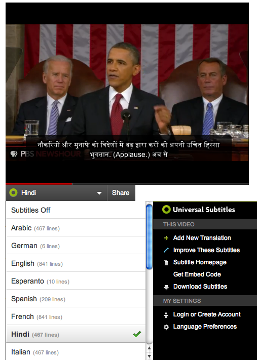
After last year’s innovative HTML5 enabled real time analysis of the SOTU, I couldn’t wait to see what PBS NewsHour had up their sleeve for 2012. This time around, it’s much less sexy but much more important. Using the Mozilla backed Universal Subtitles tool, PBS invites the public to help translate the address into every language in the world. As of now it appears to be complete in 9 languages with about 8 more in the pipeline. Not bad for 100% volunteer efforts over 24 hours and a couple pleas via Twitter. In addition to the SOTU, PBS is also hoping to translate the republican response as well.
PolitiFact
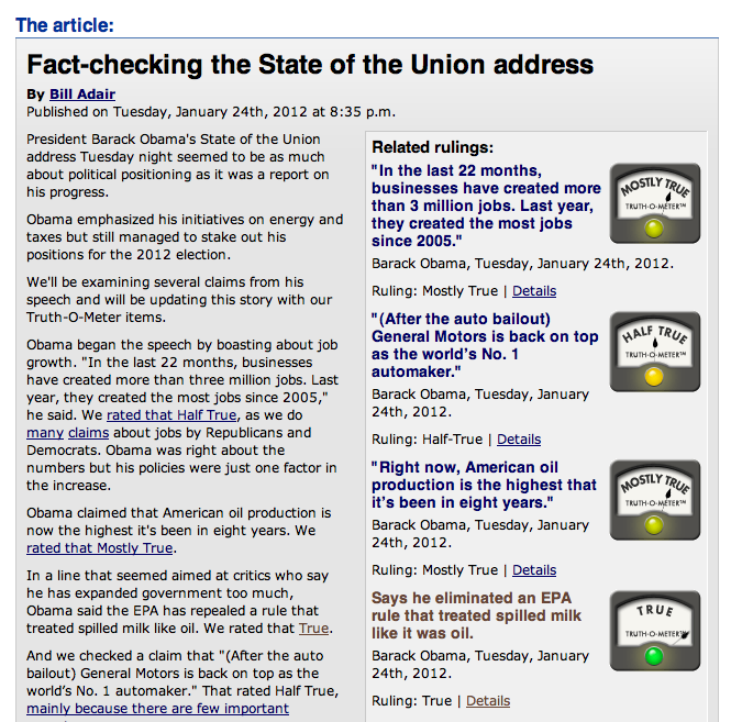
From the the if it ain’t isn’t broke, don’t fix it department, PolitiFact keeps doing what they do and doing it well. There’s not much I can say about them that’s new. I almost didn’t include them in this post as I try to stick to the spirt of innovation and one shots, but after spending 20 mins. on the site, it just wouldn’t be fair not to acknowledge that grandpa still has legs.
The New York Times
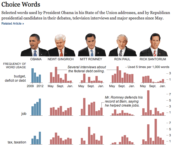
This New York Times graphic didn’t jive with me at first glance — the information isn’t easy to read right away and it feels it should be interactive and it’s not — but after a little analysis it starts to reveal an important narrative of what’s on everyone’s mind and how the next couple of months may play out as the rhetoric heats up. As a journalist I might look at this and see that perhaps I should dig deeper into research on topics like jobs and taxes as they may become the talking points later. It’s also interesting to see how the trends have come and gone, such as the deficit being a hot topic earlier in 2011 before it started to teeter off for some.
The Washington Post
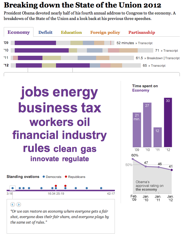
The Washington Post decided to take a similar route to the NYTs but rather than look at the President’s words as compared to other candidates, they compared them to his past three addresses. The data heavy picture that emerges is President Obama’s time in office has been consumed by the economy and talk of jobs for the most part. The piece is packed full of transcripts, charts and graphs and has some useful bells and whistles like the standing ovation tracker which reveals that Republicans agree with drafting a bill to ban insider trading by congressmen but aren’t too keen on raising taxes on the wealthy. Overall a very well packaged interactive with tons of data to pour over.
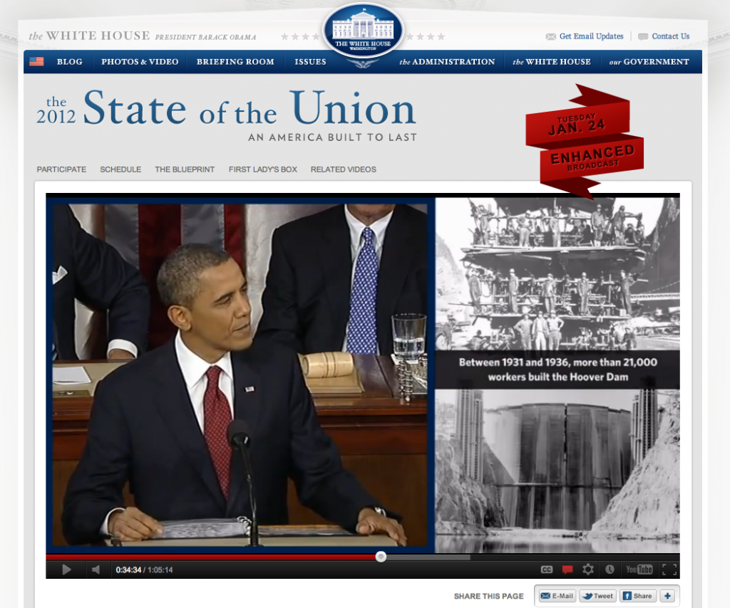
And finally, our Top Dog: The White House
Once again Whitehouse.gov live-streamed the address — as they have done since 2002 when George W. Bush look to the digital airwaves — but as has become indicative of the Obama presidency, they didn’t hesitate to put some pepper on it.
The centerpiece was an interactive video with captions, embedded links to more information, a call to submit questions or feedback via Twitter #hastags (#bashtag?) #WHchat or #SOTU, and links to full transcripts, share buttons, the history of why we have a State of the Union and even some fun facts for some light triviality.
Beyond the video of the address, the site lists events to take place over the coming days in which various Q&As hosted on YouTube, Google+, Yahoo and Facebook and is encouraging users to engage by providing some of the questions.
They even anticipated the tangental ‘who is sitting next to the first lady’ angle and created a nifty little interactive with pictures and bios of each person (hmm, there’s San Antonio Mayor Julián Castro, I covered him so much when I worked there). Very impressive and I must say it’s the best interactive I’ve seen on the topic even when compared to efforts from established media.
The one drawback is the lacking design of the video with its patched together PowerPoint-esque slides fading in and out and the fugly blue border and background, but that’s a minor nitpick.
So what’s that leave for journalist? Well come on!
Now it’s time for journalism to really shine where it works best, in the analysis, fact-checking and hitting the streets to hear what your community is saying. As news sources start going directly to the people (think of how many stories cited a Twitter post as the first source for breaking news in the past year), the journalism switches to that of making sense of the information and analyzing what it means rather than regurgitating a press-release with some quotes for color. I don’t know about you, but that excites me.
What’s your take?
Did the Whitehouse.gov take the top prize? What interactive did I miss? Most importantly, as news sources start to cut out journalist and take the message direct, what’s this mean for journalist and how we cover such events in the future? Leave a comment or head over to my Facebook group (link in the header and footer) to share your thoughts with others.


